Thursday, August 22, 2013

Troubling Time with Tableau

Since moving to the public sector, I've used a lot more software packages than I thought. Prior to my current gig [which you can check out on my linkedin page], I worked for a quasi-tech company. Some would say it was a sales company with a tech focus. Either way, coding was much more open source than my current gig (for better or worse). Over the past few months, I've transformed into a data artist, also known as a Data Visualizer. Although what I do for work is not public, I've done some other public work that I can reference to express my views on software. Ok, enough talking already. Below is the visualization, enjoy and read my rant that follows.

My Goal: As the Atlanta Braves continued to pound the Washington Nationals, I wanted to know when that gap really began. So, I started by plotting the game by game wins. You can see that below or for a better view this link http://public.tableausoftware.com/views/NLeast/Dashboard1?:embed=y&:display_count=yes :


My troubles:

1. Messing with the titles, axis and scale proved to be harder than expected. For some reason you cannot move the column name below the numbers.

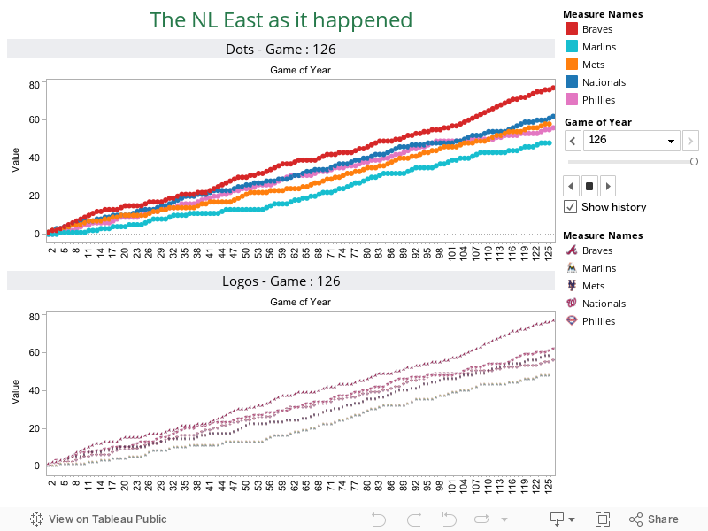
2. Making the teams’ logos was also complicated. Not impossible, but it required a hack.

3. It is literally impossible to make this a rolling line graph. I have NO idea why. I searched around and found pseudo-hacks, but for a game to game basis this was actually impossible.

4. I wanted to add more teams; but I thought it would get cluttered. Another problem was that I couldn't group things. I wanted to do hierarchical analysis, where you could compare the NL East, the NL, and the NL wild card. However, for reasons not known to me, I couldn't do this. Apparently Tableau has this feature, but it wouldn't work.

5. The play feature doesn't work on the web. There should be a 'play button' that will moves from game 1 until game 126. This was a huge downer for me. Mainly because I didn't realize the 'Public Version' lacked this functionality.

 My view on Tableau : 

As companies continue to think “big picture”, they need a “big picture”. That is where tableau succeeds. Unlike Excel, Tableau is quite good at handling more than a million records. It can do some pseudo-sql and allows the users to drag and drop data. That being said, Tableau is somewhere between Excel and say D3 (which I love). A person not familiar with programming can use it, but it allows people to devote 40 hours a week on making reports that are palatable. Most proprietary software, Tableau included, is slow to adjust to new trends. Design teams function because they design fast. When branding your company, you need to think abouttomorrow not today. Tableau 7 still struggles to use newer types of visualizations like word clouds and bubble charts. Rumour has it Tableau 8 has these features, but that requires (ughh) a new license.

Stackoverflow is the new F1: 


I had a college professor who never required a textbook, which was simultaneously great and horrible. It was great because I didn't have to spend $300+ on a book that I would likely read once, but it sucked because we did not have reference material. He would always say, “F1 (which is the help button) is your textbook.” When working for a company, they rarely tell you to use F1. So, you generally have a few options. You can ask to the company expert in that software, you can call the software vendor for customer support or you can Google it (which ultimately takes you to stackoverflow). The open community seems to be hurting the software companies. Before the internet people had to find that person, now it’s much easier. With a simple web query, you no longer need customer support, which means you may not need the special software.

Sunday, March 17, 2013

Can you picture this?

A few weeks back I attended a nerd mecca MIT's Sloan's Sports Conference. While the exact details of the conference are pretty irrelevant, there were a few talks that really sparked my interest. One was about social media, while another was about data visualization. Most people love statistics, but few really know how the difference between a Poisson and Exponential distribution. It is often the goal of the statistician to tell a story about the data using fancy math and pretty pictures. If I showed you a picture of a bar packed full of people and another bar with no one in it, you would probably be able to deduce which bar was getting more sales. As Data Scientists, Statisticians and Analysts our job is to find the data then explain it. I was also interested in data visualization because I felt it could help me in my non-sports day job [learn more about it here].  As always, if you like what you see, send us a comment at patch.stats[at] gmail [dot] com, would be happy to help out.

This video is awesome and will explain a few things. http://www.youtube.com/watch?v=sfrGaTV217g 

It is more than just pictures.

We have a saying in the small group I work in : "If it is in excel I dont trust it". Sure we are a little pretentious about our graphs, but it says a lot about the user behind the data. Think of it this way, using excel is like spraying axe all over your body, it may put a small cover of scent over the teenager but it does not make him any smoother or good looking to his date.

The first example here is plotted using statistical software. Don't worry, you are not suppose to understand what is going on, that is the point. A good eye can probably only handle five colours, and maybe five shapes, which is more than I can provide in the graph below. It looks like a four year old got a handle of the crayon box and just started scribbling. Simple plots are just for that, to plot a simple amount of data. There are indeed several other ways I could have presented this, could have created 12 different plots with maybe 4 teams on each plot. The point is, in an era of Large Information [my buzzword killer for big data], we want to see ALL the data, not some of it.

So little red riding hood had a p-value of .01

Unless you took a statistics class, or business class trying to sell itself as a statistics class, you probably have no idea what a p-value is, nor if it being .01 is good or not. I'll give you a hint, it normally means something is broken, but sometimes we want things to be broken :).  With numbers and hipsters came the infographic, and boy are they great. The infographic tells the story, with great typeface and clever spacing. A infographic tells you to not trust wolfs in the woods, and that if you are an egg, you shouldn't be sitting on a wall. What a infographic does not tell you is why Bears were eating porridge  but the blonde girl wasn't. Below is an example of an infographic, you should pick up really quickly that Manchester United is a very good thing [I left out that they were a football team].


I see the data but I do not feel the data

I often find that when I give a presentation there is always a question about 'what if'. So if we scored two more goals, what would our probability of making the playoffs be. While I do have webbapps for that (thanks to some fancy coding and awesome software), I'll leave a more user friendly version online for everyone. People want the ability to drag,drop and dictate. As a user, one can select the graph they want and click print to make it a pdf or simply an image to put in his/her corporate powerpoint. People love choice, its the reason why so many iphone cases exist, they all serve the same utility purpose but each one represents the freedom we have to present ourselves. What is also nice about these webapps is that it can give a default picture. While I've worked with bright people who love to play with the data, I've also worked with my fair share of 'hit me with the fact' type of people who just want to know as soon as possible what the data is telling them.

I wrote two scripts that you see the power of choice. I highly suggest that you view the test version of this on my webpage patchstats.co.uk/table1 . This graph allows you to choose which teams you want to view, and will automatically update by pulling data down from a data source such a Hadoop,Hive or other databases.


Another web app verison is also pasted below

For full readable use, view the full version here patchstats.co.uk/table2

Friday, March 1, 2013

Nom Nom Nom Oreo

So after siting in the Sloan's Sports Conference Talk about ticket analytics, I began to realize my obsession with marktes and learning when to buy and sell the most useless objects. There has been a lot of debate of recent whether dynamic pricing is great for the consumer or burns them in the long run. I've had a lot of consumer side of the story from Dynamic pricing. My friends always have the rule 'Last one to show up brings Fritos or Double Stuf's'. As someone who is often late, I've come to learn the price of Oero's Double Stuf's.

The Amazon Prime
I come from the naive belief that with my Amazon prime, everything must be the cheapest on Amazon. This is not a bad post on Amazon, because I love them dearly  but not everything is cheapest on the Internet. I bought an Aeropress the other day, and with my regular priced coupon at Bed Bath and Beyond, I actually saved some money. However, this did not stop me from attempting ti subscribed and save to Oreos. I was trolling around their supply when I came across my first real understanding of Oreo pricing. I bought a 4 pack for 9.50 [with free shipping]. At the time I was very knew to the Double Stuff market, but for some reason this seemed good. Sure enough 3 days later, my box arrived with my newly delivered treats.

The Run Out
Like all good things, those Oreos were consumed in my apartment, and we needed to restock. I went back to Amazon, went to click 'reorder' and noticed that the prices were much much higher. Being the Data Scientist I am, I closed the browser, cleared my cookies and even opened a new window incognito. All this effort was a waste, because suddenly the prices were around 18 dollars for the 4 pack, or around 4.5 a pack. Again, I was quite naive to the market, so I decided to investigate.

The Grocery Store / Mega Store Competition
I thankfully, live near both a Super Target and a Grocery store. They both have there perks, and both surely have their downsides. However, as I would begin to pick up these treats ; I began to notice a few odd things that were occurring  At Giant (the grocery store), the price really depended on what was on sale. The sale price was a really good $2.50; but its average price was much higher around 4 dollars even.  Target on the other hand, always seemed to have the same price, set at $3. I've been conducting my ermmm 'Research' for quite a while now, and I've never seen a sale on the Double Stuf's at Target.

So it Begs the Question : Where Do I go.
Lets use so elementary Math, and a little bit of situational circumstances and play my favorite game; where do I buy my double stuf's. Let's assume you dont read those garbage flyers that come in the snail mail, and you dont know if a sale is going on right now. However, you noticed that Oreos are generally on sale once a month, but that week is completely random.

Oreo at Giant |
P(Sale)*(Oreo Price on sale) = 2.5*(1/4) = $.625
P(No Sale)*(Oreo Regular Price) = 4*(3/4) = $3
Total Expected Cost at Giant = $3.625

Oreo at Target = $3.

The key to understanding this, is that if we dont' know when a sale is going to occur, we are the mercy of the inflated price. I'm not saying that we should go out and build the Kayak for Oreo demand, but even the Oreo market has variable pricing.


Monday, February 25, 2013

The Ticket Price Dilemma

There are tickets and there are seats, and surely prices to go along with them. Various sports handle this question differently. In American Football there is generally one price , 8 home games does not leave a lot of space for supply to outreach demand, even at the highest prices. American Baseball has the exact opposite problem as American Football. With 82 home games, and over 40,000 seats per game, it leaves a lot of space to throw in the bobble-head deal. Then somewhere in-between are even more interesting problems, European Football [19 Home Matches], America Soccer [17 Home Matches], North American Hockey [41 Home Games]

Each Sport has its own approach to setting ticket prices. American Football charges a lot of money, because each game relatively speaking will get the same draw of people. National Hockey fans uses a supply and demand of the opponent to gauge the price of the ticket. The winning percentage of the opponent generally causes the price of the ticket, the assumption is that the game will be quite boring. This also follows suit in baseball, where just until recently a person could buy a ticket for as low as a dollar (thank you bobble head day at Nationals Park). What is truly interesting is the European system of setting ticket prices. Teams charge more for how they believe teams will finish at the end of the year. Below is Liverpool's fee schedule 

Category A games: Arsenal, Chelsea, Everton, Manchester United, Manchester City, Tottenham Hotspur, Newcastle United £48.00
Category B games: West Ham, Reading, Aston Villa, QPR, Sunderland, Norwich City, Fulham @ £44.00
Category C games: Swansea City, WBA, Stoke City, Wigan Athletic, Southampton @ £42.00

What is interesting is how wrong those projections were.


Rank Team Points Cat
1 Manchester United 68 A
2 Manchester City 56 A
3 Tottenham Hotspur 51 A
4 Chelsea 49 A
5 Arsenal 47 A
6 Everton 42 A
7 West Bromwich Albion 40 C
8 Liverpool 39 -
9 Swansea City 37 C
10 Stoke City 33 C
11 Fulham 32 B
12 Norwich City 32 B
13 Newcastle United 30 A
14 West Ham United 30 B
15 Sunderland 29 B
16 Southampton 27 C
17 Wigan Athletic 24 C
18 Aston Villa 24 B
19 Reading 23 B
20 Queens Park Rangers 17 B

Think about the bargain the West Brom game was, or for that manner the Swansea match (who went on to win the Capital One League Cup this past Sunday). The pricing makes sense for those in A, even if Everton was about to be relegated they will always be an A (local rivals).

Manchester United : The Best Show in Town
As shown above, we can see that Manchester United started to run away with the league, but are people coming out to watch them more than other teams?

Its likely that most teams are selling out anyway. The line going across the plot demonstrates an equal proportion, meaning Manchester United sold as many tickets as the averages of other matches. Anything above the line means Manchester United attracted more spectators than other matches. So it does look like people want to come out and watch Manchester United.


Above is some baseball analysis, a very easy one to do. It takes into consideration the days in which a team plays as well as the opponent. I like to show the Rays, because when the Yankees come into town their attendance suddenly sky-rockets, but when they played the Washington Nationals last year, the attendance was surprisingly low, and both teams made the playoffs! Albeit the Yankees are a well known playoff team, and the Nationals had one heck of a run last year.

I'll close this post with a conversation I had with my father about this very topic. I explained how ticket prices depends on a lot of factors (including the weather). I recall his exact words 'Well that isn't fair, why isn't it always the same price?'. Well... the ticket pricing works two ways, it allows me to get a bobble head for a dollar, but also means I have to pay extra when the phillies come into town [for those unaware Philadelphia is a about 2 hour drive to Nats park, it tends to attract Phillies Fans]. A low ticket price allows casual fans the chance to watch a game at a lower than average price ticket. It would be an interesting argument to make, that Dynamic Ticketing increases the popularity of sports, and has created an event at the ballpark instead of just the sport.


Sunday, February 24, 2013

Liverpool

It goes without saying, but Liverpool have been all but a success a this year. As my beloved Reds sit in 7th, behind Everyone, Arsenal,Tottenham,Chelsea,Man City and Man United, all of which have a game in hand. Most fans would agree that Liverpool are 'playing' better, but subjective words always sound good because we can grasp on them with hope instead of having our dreams crushed by some matter of fact number. The question really is; are Liverpool actually doing better.

Cups and Leagues:
Competition | Finished Last Season | This Season

Capital One Cup : Won | Out in Round 4 to Swansea
FA Cup : Loss to Chelsea in Final | Out in Round 4 to Oldham
Barclay Premier League : 7th | 7th
Europa : NA | Second Round

On the same day last year, Liverpool had played a total of 34 games, this year that total was 43. To say that Liverpool needed a striker was an underestimate. Liverpool's attack ranked 11th last season, and so far this year they are 5th, while their defense ranked 3rd and now ranks 8th. So although the 'Possession' style football may have increased the total number of goals, it seems to be leaving a lot more holes in the back. This is quite surprising, since Skrtle and Agger are some of the best top class strikers in the world.

Liverpool seem to fall apart in the second half. If the game only consisted of 45 minutes, Liverpool would rank 4th in the league. They also fail to recover from a goal; when Liverpool's opponents scores first they average only .6 points from those matches (1 win 3 draws 6 loses).

Liverpool scores there goals in the latter half of the game. There peak goal proportions is around the 60th. What is also interesting is Liverpool's inability to score a late goal.


Daniel Sturridge has scored the 3rd amount of goals in 5 games with Liverpool. His four goals puts him behind Suarez (18) and Gerrard(7) but with not nearly the amount of games. Liverpool received more goals, but more goal scorers.  Suarez only trails Robin Van Persie for the Golden Boot (and he only trails by one goal). Sturridge definitely helped this, during the barrage against Swansea Sturridge created a lot of chances.

So a year later, and Liverpool are in the same ranks. I've lived by an old saying 'If you aren't getting better you are only getting worse'. Its true for Liverpool as well. The 'hope' began to show its true head, and it does not look great for Liverpool.

Failing
JonJo Shelvey has failed to produce. An I'll be honest, I never really thought he would. If it was not for the show 'Being Liverpool' I would have never expected Brendan Rodgers to select the young lad. In prior years he was always way to eager to take a shot. He has terrible ball handling skills, which is very uncharacteristic of a Rodgers player.
Raheem Sterling had the world on his shoulders and stood tall, but never threw the world off.  He simply played to get the minutes, or so it appeared. He always played it safe, never going for an aggressive run to score, or to prove himself. At the same token he never really made a massive mistake.

Passing
Jordan Henderson looks great on the pitch. He moves the ball well, and a has a solid shot. He looks like a future liverpool star.
Stewart Downing never deserved the hate. He may not be the goal scorer most people expected him to be. However, Downing holds the ball well and leads for a lot of set ups. He should be able to continue to be a star.

Monday, January 14, 2013

It’s a business not a sport


It’s a business not a sport.

If you don’t know, Robert Griffin III got injured during the 2nd quarter of this week’s wild card game. There has been some criticism whether or not he should have continued to play after what appeared to be an earlier strain on the knee. I’ll tell you something RGIII and I have in common: we both are not doctors. Accordingly to RGIII though, he knows the difference from pain and injury (thank god because that would make this whole MRI thing useless).  Now enough of my rant about injury what could be years off RGIII’s career, I’m here to bring data into the issue.

Cost benefit analysis (CBA) often involves analyzing the risk of playing and the benefit of winning a playoff game does to his salary. Let’s make it clear, RGII was hurt at sometime during that game, call it an injury or lack of performance, but RGII started to cost his team yards and points. Since his ‘run out of bounds injury’, the team had the following results: 13 yards | punt, 3 yards interception, 23 yards | punt,4 yards | Punt, 17 yards | punt, -19 yards | fumble.  RGIII simply couldn’t put a drive together to score points. For a while, his team was lucky, because the Seahawks were still trailing, so they had time to score more points. However, as they gained momentum, and RGIII kept going into the injury shed, the probability of winning shifted.

This is the win probability of the Redskins, see that reversal right after their second touchdown, that is when RGIII got ‘hurt’. As we can see, the Redskins were decreasing their probability of winning at a very high rate, something a coach should be concerned with.

The thing is when coaches, managers or doctors remove players to prevent injury there is uproar. Recall when the Washington Nationals removed Stephan Strasburg to prevent long-term damage to his arm. ESPN was yelling foul, saying that they should have kept him in to create a push. Strasburg saw something that most players do not see; the short-term incentives can limit your career.

Lets say that RGIII gets an extra $2 million dollars for winning that game, of course he is going to stay in that game. $2 million dollars is a lot of money, and for all he thought he was just in pain. However, that injury could cost him 4 years of his career in the long run, and lets say that’s $8 million dollars. But as we all know, that $2 million dollars is coming today not 4 years from now. As degreed before, you put your best players out there to give your team the biggest chance of winning.

Why this is not RGIII’s fault. A good coach would have noticed that RGIII was no longer maximizing his team’s ability to win that game. In fact (with a mixture of their spotty defense), he was hurting the team’s chances of winning the game faster than when he was helping. During the press conference, Mike Shanahan said ‘he was our best player’; but he couldn’t be more wrong. Once he couldn’t run, the quarterback became very predictable.  The NFL has the luxury of unlimited substitutions; meaning he could have taken RGIII out earlier and let his leg rest while the team was wasting away their lead.

If we could prevent injury, would we?

Friday, November 23, 2012

If Nate Silver is a Wizard

If Nate Silver is a wizard, I'm calling out all the squibs. Now to clarify, that is a loaded statement; so dont panic if you do not get all of that at once.

A few weeks ago, Nate Silver appeared on several television shows speaks the gospel of science. Since a lot of people can't explain math, someone created this website "Is Nate Silver a witch?". Wizard/Witch or whatever, Mr. Silver has a nacht of being very correct when it comes to predicting and forecasting. His recent publication explains the troubles and joys of forecasting. Inside The Signal and The Noise Silver complains about fakers,posers or as I like to call them squibs.

A squib (apparently a bad word to say in the Harry Potter Universe) is a wizard born without powers. Now I'll adapt this for my argument  I'll define a squib as a half-wizard / half-human. Basically a weak wizard who walks amongst the muggles thinking he/she holds the strongest magical power. I'm calling those people out.


I recently read this article that attempts to create journalism from pasted together statistics. If one were to make it to the bottom of the article, he/she would read "There is no statistical proof that Fergie time applies specifically to Man Utd." This of course, after the author spoke highly of all the statistics she had compiled, even citing the leader in sports data analysis,Opta.  This along with "On Rainy Days he is five for six when batting against a blonde pitcher on tuesday", these novel statistics ruin the magic. When one searches large data, it is quite easy to find patterns that tell a story, but there is a difference between correlation and causation. A squib finds statistics to tell the story, instead of using statistics to tell the story. This subtle difference is actually not subtle at all.

Statisticians, Data Scientist and Mathematicians are not wizards, they are scientists. Statisticians (used loosely to defined those previously mentioned) use math to solve trends and predictions. They are the modern physicists,chemists and biologists. Like physicists before them, Statisticians are figuring out 'why the apple falls from the tree'. These solutions have repeatability and can be applied with the right wizard statistical training. That training is not something to take lightly.

Squibs claim to be wizards but are merely just muggles pretending to wizards. They tell the world it will rain tomorrow, but nothing in the modeling says it should. They are statisticians that leave extra variables in their models because it 'looks cool'. They don't check the assumptions when applying linear regression, they dont even make sure their errors are normally distributed. These are the people that use statistics without the theory. They don't use training sets, but test their theories in production. These squibs are so determined in their ways, and will make crazy predictions with no real science. Squibs are those friends who have no cooking experience but claim to make the best pumpkin pie; they are the runner on the track with the speed dome to help with wind resistance. Squibs drive the 92 civic with the after market spoiler, a squib never played football but has £200 spikes. Everyone knows a squib in one way or another, but I'm calling out the statistical squibs.

Why hate the squibs? Squibs preach words they dont know, methods they truly never learned. Like running, statistics requires the proper training. If one were to just try and run a marathon they surely would pull a muscle, bad statistics are the pulled muscle. Sports commentaries are pulled muscles, explaining to the audience that it is risky to go for on fourth and one, when actually the odds are equal.

I'm not hating on muggle-borns (people without wizard powers, but acquire it). People that respect statistics, the people that know a 2:45 marathon is impressive but never ran a marathon. The people that know Nate Silver is actually not a wizard, but a smart man who's results have been proven to work. These people respect statistics, but dont claim to make outrageous predictions.'Using my Model the GDP will go up 150%", it says so because of "wavy hands". Muggle-born know that people who make failed predictions have to explain their errors. They know that when they hear 'its going to be a close election', but the polls show a huge blow out, that the pundits need to explain their error.